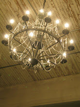
i just always come back to simplistic, clean, (primarily) white design. love the distressing and antique looks going on in these two spaces...prevents the whiteness from becoming sterile and univiting. oh, and NICE use of splashes of complimentary colors!
images from delight by design.
Subscribe to:
Post Comments (Atom)


No comments:
Post a Comment